Hidden symbols for creating unique logos are often the decisive factor that transforms a standard wordmark into an exclusive trademark with high added value. Many beginner designers limit themselves to the characters available on their keyboard, never suspecting that a high-quality premium font might hide hundreds of additional characters. These characters are called glyphs. Understanding how to find and combine these hidden elements allows you to create a brand identity that is nearly impossible to replicate without purchasing the corresponding font license. In this article, we will break down the types of glyphs that exist and how they help in developing professional branding.
What Are Glyphs and Where Do They Hide?
A glyph is any graphical representation of a character in a font. The letter «A» is a symbol, but it can have five different designs: classic, with a long tail, with a curl, or a narrower version. These variants are the glyphs. In free fonts, the number of glyphs is usually limited to the basic set of letters and numbers. Premium typefaces from Creative Fabrica, however, can contain up to 1,000+ glyphs.
To access these treasures, professionals use the «Glyphs» panel in Adobe Illustrator or Photoshop. If you work in simpler editors, the standard Windows «Character Map» or «Font Book» on Mac comes to the rescue. This is where the decorative elements that make a logo unique are hidden.
1. Swashes: The Art of the Flourish
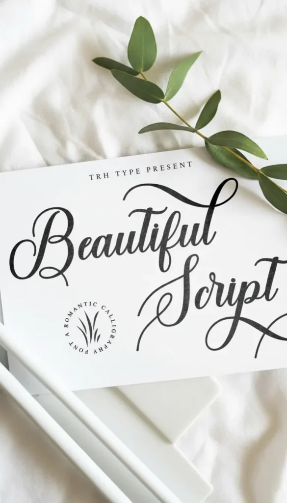
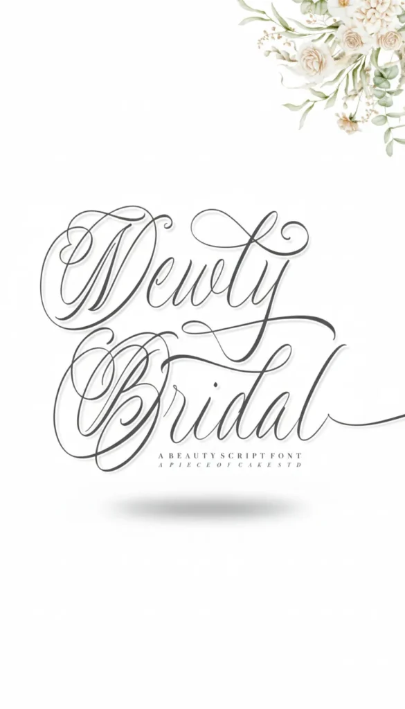
Swashes are decorative extensions and curls on letters. This is the easiest way to add elegance and dynamics to a logo. Swashes are most commonly found on capital letters at the beginning of a word or lowercase letters at the end.
Using hidden symbols for creating unique logos in the form of swashes allows you to «loop» a wordmark, underline it from below, or create a visual connection between the first and last letters. The main rule here is moderation. One effective flourish in a word looks like art; five look like visual noise.
2. Discretionary Ligatures: Seamless Connections
A ligature is the combination of two or more letters into a single symbol. We are all used to standard ones like «fi» or «tt,» but premium fonts feature «discretionary» (decorative) ligatures. They connect letters in the most unexpected and aesthetic ways.
For example, the letters «s» and «t» can gracefully intertwine their upper elements, creating a single line. This is a ready-made logo element that does not need to be drawn by hand. Using such connections makes the inscription monolithic and professional, removing the «typewriter effect.»
3. Stylistic Alternates
Sometimes a single letter in a word can ruin the entire composition. For instance, a «y» might descend too far and interfere with the subtext. In a good font, there is always an alternative for such a letter—with a shorter tail or a different tilt.
Stylistic alternates allow you to «fit» the font to the needs of the composition. You can replace a standard «g» with a more vintage double-loop version or choose an «E» without the central bar for a minimalist techno-logo. This is typography work at an expert level.
Font Capability Comparison
| Feature | Free Font (Standard) | Premium Font (Full Access) |
| Character Count | 100–250 | 600–1,500+ |
| Swashes and Curls | Absent | Abundant for every letter |
| Ligatures | Basic only | Decorative and custom |
| Language Support | Often Latin only | Multilingual |
How to Use Glyphs for Logo Design: A Step-by-Step Plan
- Select an OpenType font. Look for the «OTF» tag and descriptions like «Includes glyphs and alternates» on Creative Fabrica product pages.
- Type the brand name. Look at it in its standard form. Boring? Now the magic begins.
- Highlight one letter at a time. Open the glyphs panel and see what alternatives the author offers for that specific letter.
- Experiment with word endings. Try replacing the last letter with a version featuring a swash that extends to the right or underlines the word.
- Check the ligatures. See if letters inside the word can be combined to create a unique rhythm.
Technical Nuances and Tips
- Kerning is paramount. When you replace a regular letter with a swash glyph, the spacing between letters (kerning) might shift. Always adjust it manually so the logo «breathes.»
- Scalability. Remember that very thin swash lines might disappear when the logo is significantly reduced in size (for example, on a website favicon). Always test the logo at small sizes.
- Licensing. If you are creating a logo for a client, ensure your license allows the use of the font for commercial branding purposes. Licenses on Creative Fabrica typically include this right by default.
Conclusion
Hidden symbols for creating unique logos are not just decorations; they are a powerful positioning tool. In the hands of a master, an ordinary font turns into a flexible construction set, allowing for the creation of visual images that look expensive, unique, and professional. Stop using fonts «as they are.» Look inside, explore the glyphs panel, and start using the hidden potential of typography to make every project a masterpiece.