Perfect font pairs serve as the foundation of any brand’s visual communication, determining how the audience perceives the meanings and values embedded in the design. In a world oversaturated with information, a font ceases to be just a set of letters—it becomes the voice of the brand, its tone, and its character. However, choosing one beautiful typeface is only half the battle. The real magic begins the moment two different typefaces collide, either complementing each other to create a harmonious duo or entering into a visual conflict that destroys the integrity of the project. In this article, we will break down five time-tested typography formulas that will help you look professional and high-end.
1. Tradition and Modernity: Serif + Sans Serif
This is the “gold standard” of typography. Combining a classic font with serifs (Serif) and a modern sans-serif (Sans Serif) creates an ideal balance between authority and accessibility. The perfect font pairs in this category are usually built on the principle of strong contrast: a headline executed in an elegant Serif carries history and reliability, while the body text in a Sans Serif provides maximum readability on digital screens.
This combination is ideal for educational projects, law firms, or premium lifestyle blogs. It says to the viewer: “We respect tradition, but we keep up with the times.” When choosing such a pair, make sure the fonts have a similar internal structure (x-height) so that the eye’s transition from the headline to the text is smooth and natural.
2. Radical Minimalism: Sans + Sans (Contrast by Weight)
Who said that fonts must necessarily be from different families? One of the most stylish techniques in modern branding is using two different weights of the same (or very similar) Sans Serif typeface. The secret here lies in extreme weight contrast: for example, an Extra Bold headline and a very thin (Light) body text.
The perfect font pairs of this type create a sense of cleanliness, technology, and confidence. This is a favorite technique of tech startups and architectural bureaus. The absence of unnecessary details in the letters allows the focus to remain on the product itself, making the design “sterile” in a good way. To keep this pair from looking boring, add plenty of white space between lines and letters in the body text.
3. Elegant Accent: Script + Serif
If your brand is focused on the beauty industry, wedding floristry, or the production of craft goods, you cannot do without a handwritten font (Script). However, using a Script for large volumes of text is a fatal mistake. Perfect font pairs in this style involve using a calligraphic typeface only for short accents or subheadings, while the main information load is handled by a classic Serif.
This combination creates a sense of handmade quality, exclusivity, and a personal approach. It is important that the Script font is sufficiently legible and that the Serif does not compete with it for attention. It is best to choose serif fonts that have soft, slightly rounded shapes so that they resonate with the fluid lines of the calligraphy.
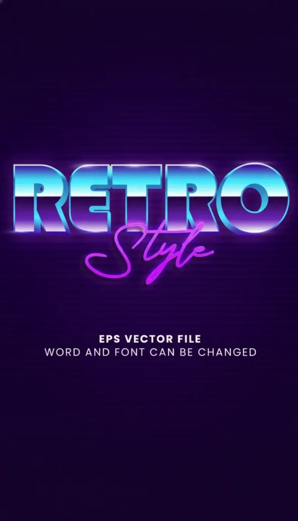
4. Retro Vibe: Display + Monospace
In recent years, a wave of nostalgia for the 70s and 80s has swept through design. Psychedelic, bold display fonts (Display) with unusual letter shapes become the center of the composition. To balance such an active headline, designers often choose monospaced fonts (Monospace) that mimic a typewriter or computer code.
The perfect font pairs in the retro-futurism style are great for merch, music album covers, and youth clothing brands. The contrast between a “wild” headline and a strict, almost technical text creates a unique tension that forces the viewer to linger on the layout. This is a bold choice for those who are not afraid to stand out.
5. Friendly Organic: Rounded Sans + Soft Serif
For brands related to ecology, children’s products, or healthy eating, aggressive angles are a taboo. This is where perfect font pairs with softened forms come to the rescue. A rounded Sans Serif in headlines communicates friendliness and safety, while a soft Serif with short serifs adds structure to the text without depriving it of warmth.
This typography looks “human” and cozy. It invites dialogue rather than dictating terms. To enhance this effect, use muted natural shades in your design: olive, terracotta, or sand.

Technical Rules for Successful Combining
Even the most perfect font pairs may not work if you do not follow basic principles of hierarchy:
- Visual Hierarchy: The reader should immediately understand what is most important. A headline should always be significantly larger or bolder than the body text.
- Kerning and Leading: Do not be afraid to adjust the distance between letters and lines. Headlines often benefit from tighter kerning, while body text needs increased line spacing for ease of reading.
- Readability Above All: No matter how beautiful a font is, if it is difficult to read, it is useless. Always test your pairs on real volumes of text.
Why You Should Choose Premium Fonts on Creative Fabrica
Using free, overused fonts often leads to your brand looking “like everyone else.” Premium assets offer much more developed character sets, support for multiple languages, and, most importantly, unique ligatures and alternative glyphs. Investing in high-quality perfect font pairs is an investment in the unique voice of your business. On Creative Fabrica, many fonts are already sold as ready-made duos (Font Duos), where designers have pre-selected harmonious combinations for you, which significantly saves time.
Conclusion
Typography is not just about reading; it is about feeling. By choosing perfect font pairs, you are programming your client’s emotional response. Do not be afraid to experiment, but remember the principles of contrast and proportion. Your task as a designer or brand owner is to create a visual rhythm that guides the reader through the page, making the information consumption process easy and enjoyable. Start with classic pairs and gradually move on to more daring experiments, because in the art of type, rules exist to be beautifully broken.